• Skip to primary navigation
  • Skip to main content
Dyadic Dynamics

Dyadic Dynamics

Engagement is everything.

  • Home
  • Laboratory
  • Studio
  • Workshop
  • Buffet

Ben P. Rosenfield

How Polar Handles Troubles with its Bubbles

Ben P. Rosenfield

Polar Beverages is the company behind the Polar Seltzer brand — a portfolio of more than 20 flavors (limited editions included) of carbonated water. I reached out to them not too long ago to share a product-related concern. The way they handled my feedback inspired this follow-up to an article I wrote about brand apologies.

Here’s what I sent through their website:

Hello! Regular Polar Seltzer consumer here. Imagine my shock when I unloaded a tasty 32-pack variety into the fridge, only to find that a can of your venerable Black Cherry seltzer was underfilled!

The can was sealed properly, but it felt so light that I had to weigh it. The can weighed in at 3.75 ounces. That’s 9.375 ounces or 71.4% less than the average can, which weighs a bit more than 13 ounces.

Help me get over this heartache, Polar Seltzer friends.

Thanks!

Ben Rosenfield

Polar responds

Customer service at Polar Beverages replied approximately 19 minutes later with the following message:

Thank you for writing. I’m sorry that you experienced this empty or low fill can in the Polar product you purchased. Polar practices high quality control standards and precautionary procedures are observed throughout the production of our products.  In fact, procedures are in place to prevent low fills and empty cans such as you received.  We have a device that is called Fill-Tech that actually x-rays the bottles/cans to see the desired volume in the bottles/cans; however should this device malfunction, it is possible for some low-fills, or empty cans to escape. The information you provided will be sent to our quality team.  I will be sending you a Polar coupon in the mail.  Thank you for contacting Polar

What is great about their apology?

  • Polar sent it quickly.
  • It expresses gratitude and remorse right away.
  • It emphasizes Polar’s commitment to quality and acknowledges that the company’s quality-control systems can sometimes fail.
  • The message makes next steps clear and describes precisely who is responsible for taking those steps.
  • It explains how the company will make things right with me.

The best part of the apology is the information about Polar’s quality-assurance technology and the role it plays in preventing the problem I encountered. The sentence about the device Polar uses and how it works offers an interesting and relatable peek behind the scenes.

Discussing their Fill-Tech system was a smooth way to not only show that the company invests in solutions designed specifically to ensure product consistency, but also to explain why the problem happened. It makes the apology more memorable than the problem. Nicely done.

What about the apology could be better?

  • Punctuation and grammar. Examples in this apology include a period missing at the end of the sign-off, inconsistent hyphenation in compound modifiers, use of passive voice, a comma missing after a conjunctive adverb, and inconsistent spacing between sentences.
  • Focus on the issue. The apology says, “I’m sorry that you experienced this empty or low fill can in the Polar product you purchased.” That statement is far superior to a generic mention of an issue, but an empty can is different from a low-fill can. The lack of issue focus in the response leaves me feeling as if someone had simply copied it from an expansive apology file and pasted it into an email to me.
  • Formatting. Paragraphs prevent fatigue. They also offer an effective way to organize and prioritize information.
  • Personalization. Adding something as simple as my first name in a salutation would’ve been a nice touch.

The issues I’ve just described aren’t insurmountable problems; instead, they are very approachable opportunities to enhance this communication. I’ve called out these observations for a couple of reasons (being nit-picky as hell isn’t one of them). First, critical analysis is an important part of continuous improvement. And second, precision in an apology goes a long way to restoring credibility.

The most important thing is that I understood the apology Polar sent me. I’d wager that other consumers also have an easy time with it. It’s a very good apology that, like any communication, leaves room for improvement and merits periodic review.

Resolution

Polar sent me two one-dollar coupons. The coupons more than made up for one underfilled can of seltzer. I used those coupons to buy Polar Seltzer in newly released flavors.

I wouldn’t have abandoned the Polar Seltzer brand just because one of the innumerable cans I’ve purchased wasn’t full. But the fact that the company sent a timely, thoughtful, and informative apology — and followed up with coupons — made it that much easier for me to remain a satisfied customer.

If you haven’t read The Art of the Apology, take a moment to check it out.

If you have questions or would like more information, please contact me.


More gems for you

The Magic of Mushroom Marketing

How to Prevent Inbox Burnout

The Case for Continuous Improvement

Deli Delivers Digital Delights

The Art of the Apology

Influencing People’s Perception of Bad News

Strategy Visualization and Storytelling

The Magic of Mushroom Marketing

Ben P. Rosenfield

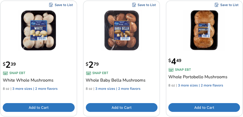
White button, crimini, and portobello mushrooms are the same. Now that you’ve learned that a part of your culinary life was a lie, let’s take a quick look at the strategies that made it possible to sell the same mushroom in three different ways.

Background

Agaricus bisporus is the scientific name for the common, cultivated mushroom. The white button and crimini are Agaricus bisporus in its immature state. The portobello is simply a mature crimini.

Differentiation

Differentiation is important, especially when you’re trying to sell identical products as unique ones. This is where marketing and marketing-adjacent disciplines make the mushroom magic happen.

Visual differentiation

Displaying these three mushrooms side-by-side or in close proximity is no problem because they look different. One is white, one is brown, and one is bigger than the others. As a result, the consumer sees three distinct products. The white button is so prevalent in the marketplace that any other product in the category will look distinct, if not special, to consumers by default.

Price differentiation

Cost increases from the white to the brown to the mature brown. This is the boldest play — particularly with the immature white and brown mushrooms — because it influences consumer perception of quality, uniqueness, flavor, and other attributes that the mind wants to use to justify paying more or less for what amounts to the same product.

Naming differentiation

The mushrooms have an assortment of names that deter the consumer from considering the possibility (the reality) that the mushrooms are the same. The white variety goes by button mushroom, white mushroom, champignon, and others. The brown variety is crimini, cremini, baby bella, etc. The brown variety, when mature, is called portobello or portabella. Most of these are Häagen-Dazs names.

Application differentiation

The mature brown mushroom is great for stuffing and serving as a substitute for meat patties. The immature white mushroom is a versatile food that lends itself to all kinds of dishes and cooking techniques. The immature brown mushroom’s oft-repeated story is that its flavor is deeper, richer, and more savory when compared to that of the white.

A word about flavor

Everyone’s palate is different, but the immature white and brown mushrooms are cultivated using the same materials, methods, conditions, and timelines. They’re harvested at the same point in their lifespans, and they’re packaged the same way. They have the same scientific name.

A blind tasting will likely show that the assertion that the crimini has a completely unique flavor profile is a load of what makes some kinds of mushrooms grow.

In fairness, the mature brown mushroom may have a different flavor. The portobello is older than the button mushroom, if only by a few days. Age can affect the flavor of foods and beverages for a variety of reasons and in different ways.

Mature mushrooms produce spores as their primary means of reproduction. Portobellos tend to deposit spores generously. The spores don’t improve the portobello’s flavor or usefulness. That’s why you’ll amost always see these mushrooms packaged with their gills facing down. This method ensures that the spores fall onto to the tray in which the mushrooms sit before you’re ready to prepare the portobellos.

Modern mushroom mania

Credit is due to the common cultivated mushroom because it is the gateway for many to explore interesting, gourmet varieties. Today, it’s likely you’ll see shiitake, oyster, enoki, foraged morel (pictured above), and other kinds of mushrooms on display at your grocery store — all because mushroom marketers developed very clever strategies for selling the same mushroom in three different ways.

If you have questions or would like more information, please contact me.

More gems for you

How Polar Handles Troubles with its Bubbles

How to Prevent Inbox Burnout

The Case for Continuous Improvement

Deli Delivers Digital Delights

The Art of the Apology

Influencing People’s Perception of Bad News

Strategy Visualization and Storytelling

How to Prevent Inbox Burnout

Ben P. Rosenfield

Message fatigue will prevent your audience from engaging with your emails — even when you have something important or new to share. Check out these tips and discover how to improve your inbox impact.

1. Create engaging subject lines.

Make the subject short, easy to understand, and impactful. A call to action and a sense of urgency build momentum and persuade the recipient to open the message.

Effective practices for subject lines
  • Limit them to 50 total characters.
  • Ensure that they capture the communication’s intent.
  • Avoid punctuation unless it’s absolutely necessary.
  • Skip sales-oriented words like free, obligation, special offer, and cost. Avoid using ALL CAPS and exclamation points!!!

Not great: Here’s everything you need to know to make choosing your next car fast and easy

Great: Let’s make choosing your next car fast and easy

The first example pushes the situation onto the consumer, suggests they’re on their own with the information, and takes a long time to share the email’s purpose. The second pulls the consumer in, shows they are not alone, and describes the email’s purpose precisely.

2. Put effort into the preview text.

Preview text expands on the subject line and gives you one more chance to persuade your audience to open your email. It’s no less important than the subject line.

Effective practices for preview text
  • Include it in all emails.
  • Make sure it reinforces the point of the email and continues the story you’ve started in the subject line.
  • Keep it to less than 85 total characters.
  • Use proper punctuation for complete sentences.

Not great: John Doe Automotive has 10,000 cars in our inventory for you to pick from! What are you waiting for?

Great: We’ll work with you to find the best car for your needs and your budget.

The first example doesn’t support or continue the story that the not great subject line above has started. But the second fits right into place with the great subject line above. It keeps the story going and shows that a superb customer experience awaits.

3. The messaging must matter.

The body of the email offers as many opportunities to turn the reader away as it does to drive engagement. That’s why it’s important for your messaging to show that you’ve taken your audience’s needs and expectations to heart.

Effective practices for messaging
  • It must deliver on the subject line’s premise and promise.
  • Use plain language (no technical or industry jargon).
  • Make the intent and value proposition(s) clear right away.
  • Use a voice and tone that are appropriate for the context and audience.
  • Only use imagery that relates directly to the message.
  • Keep it short to minimize scrolling.
  • Make it scannable by using subheads, bulleted lists, text formatting, imagery, and white space.
  • Build strong sentences and communicate in active voice.
  • Provide the reader the best way to make contact if they have questions or want support.

4. Use CTAs and links with care.

The more you focus on the intent of your communication, the more likely you are to engage. Too many calls to action (CTAs) and links sap your message’s strength..

Effective practices for CTAs

Use one CTA button to support the email’s one intent. Multiple buttons clutter the email and confuse the reader.

  • Place it early in the email to grab attention. If you show value right away, you don’t need to bury the CTA button.
  • Keep it short: two to four action-oriented words.
  • Link the audience to destinations/resources accurately.
  • Send the audience through the best experience path.
Effective practices for links

Links point to additional, important information or resources. Use them sparingly.

  • Create links from descriptive, short phrases.
  • Link the member to the right destination/resource.
  • Send the member through the best experience path.

5. Put these pro tips to work.

  • Know your audience. If you don’t understand, the audience definitely won’t understand.
  • If you have to ask whether the message is too boring, too crazy, too complicated, too whatever, the answer is yes.
  • Use the simplest language possible. Cerebral, cryptic, and obscure content won’t impress or engage.
  • Be ruthless about spelling, punctuation, grammar, and context. Simple mistakes harm your credibility.
  • Be consistent in the terminology you use. Calling one thing by two different names is confusing.
  • Make sure your email’s envelope (sender’s name and email address) tells the recipient exactly who is communicating with them.
If you have questions or would like more information, please contact me.

More gems for you

How Polar Handles Troubles with its Bubbles

The Magic of Mushroom Marketing

The Case for Continuous Improvement

Deli Delivers Digital Delights

The Art of the Apology

Influencing People’s Perception of Bad News

Strategy Visualization and Storytelling

The Case for Continuous Improvement

Ben P. Rosenfield

Many organizations are happy to harbor a set-and-forget mindset after they’ve invested in something. It could be equipment, real estate, a strategy — anything, really. They believe that wringing out every drop of value from it is the most prudent path they can take, even when today’s costs cast a shadow over yesterday’s value.

This is the sunk-cost fallacy — and it applies to content, too. A communication you spent a lot of time and money developing ten years ago may not do any harm today, but that doesn’t mean it is effective, engaging, or aligned to modern needs and expectations.

If periodically reviewing all of the communications you send isn’t part of your routine, then you’re missing out on some big opportunities to improve customer satisfaction and deliver on business objectives. Read on to see examples of how I applied continuous improvement to an important communication and how the approach I took benefited everyone involved.

The starting point

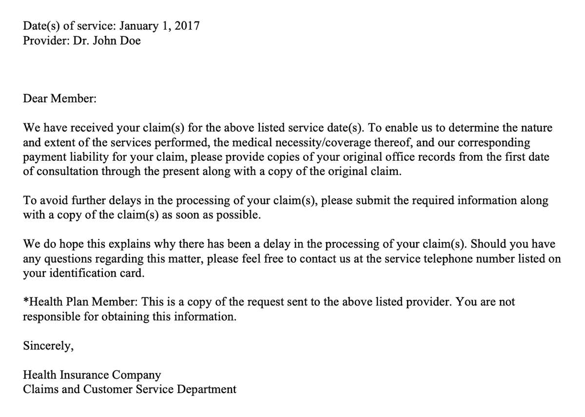
A major health insurer used to send the letter shown below to its members — more than 3.5 million of them annually. It is an operational communication, which means the insurer must send it to its members, when applicable, because it informs members about the status of their health plan. Operational communications do not sell anything.

Please take a moment to read the letter. Keep in mind that the example is cleansed of brand-specific elements, colors, contact information, names, locations, and similar details.

Ask yourself these questions as you read:

  • What is the letter about?
  • What, if anything, must the recipient do after reading the letter?
  • Would you stop reading and call the insurance company for clarification or help? If so, when?
Examining the issues

This letter uses technical jargon. It lacks brand voice, and it carries a legal or contractual tone. The communication doesn’t focus enough on the member. The letter is confusing. Only at the end does it tell the member that it’s just a copy of the communication the insurance company sent to the member’s doctor!

The letter buries the lead (lede for the journalists out there). In doing so, it fails to meet members’ functional and emotional needs.

  • Functional: the understanding needed to take appropriate action in the situation
  • Emotional: the feelings needed to believe in oneself in the situation

The communication requires a lot of cognitive horsepower to process — especially in the beginning. Those who felt fatigue early were likely to call the insurance company for a better explanation of what they needed to submit.

The first revision

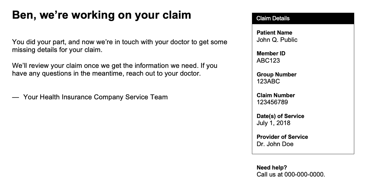
Let’s take a look at the initial overhaul. The communication’s purpose is the same, but the messaging is completely different.

Please take a moment to read the first revision. The communication is cleansed of brand-specific elements, colors, contact information, names, locations, and similar details.

Now that you’ve read the letter, answer the questions from before:

  • What is the letter about?
  • What, if anything, must the recipient do after reading the letter?
  • Would you stop reading and call the insurance company for clarification or help? If so, when?
A look at the enhancements

The new letter addresses the issues we saw in the original. For example, it makes its purpose clear immediately and conveys a much more casual tone. But there’s plenty more to enjoy. The communication also:

  • Replaces most of the technical jargon with plain language.
  • Introduces brand voice.
  • Includes deeper personalization.
  • Clarifies the action needed and who is responsible for taking action.
  • Provides next steps.
  • Uses nearly 66% fewer words to share the details the member needs.
  • Presents claim information the member might want or need to reference — and does so without getting in the way of the communication’s intent.

The communication now lets the member know what’s going on with their health plan in a way that is easy to understand, that values their time, and that prevents them from taking on work that isn’t theirs to do. It shows true content evolution.

The latest revision

The first rewrite is a wonderful example of what happens when an organization follows through on its customer-first promises. The letter, like many other communications I reworked for the company, improved member experience and satisfaction.

The latest revision builds on the goodness we find the first one and brings a key business objective into the messaging. Some background: The health insurer invested in chat technologies and, not surprisingly, wanted to promote them in hopes of seeing ROI quickly.

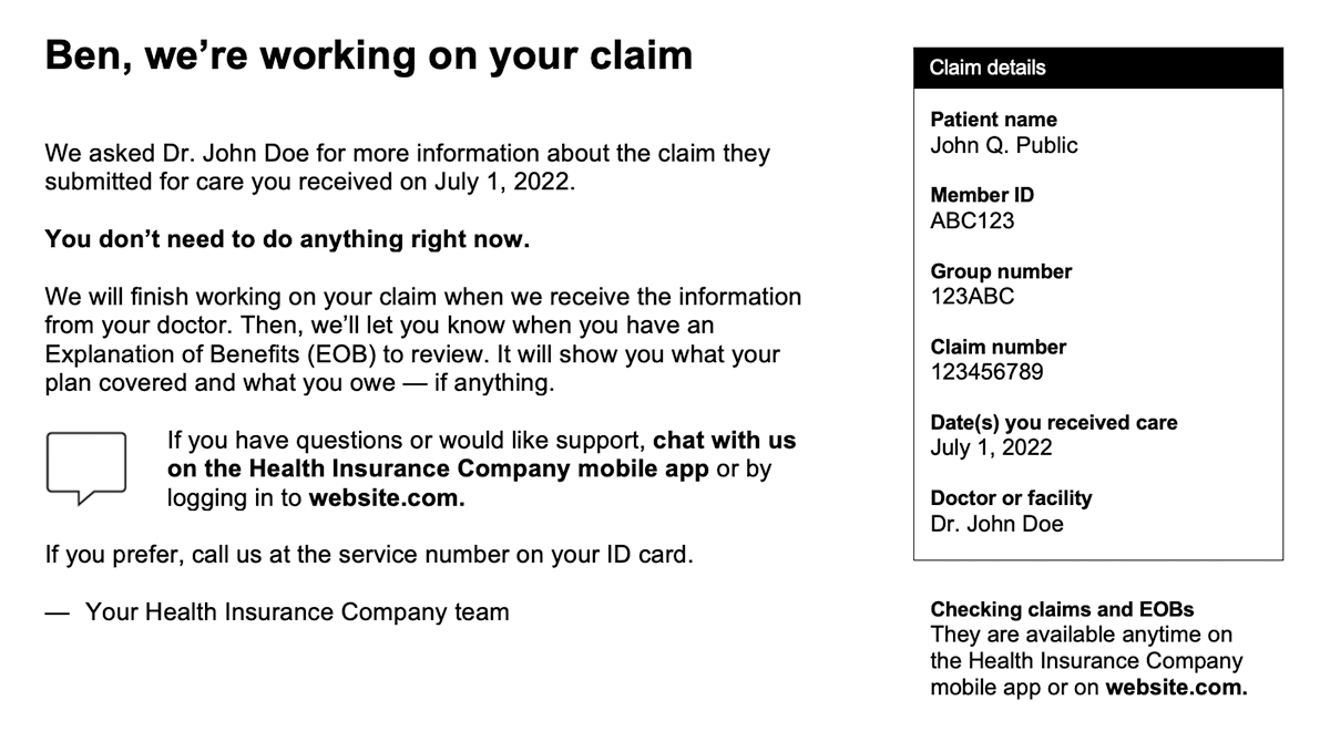
How do you accommodate an important business objective while still taking care of the customer first? Check out the example below. The communication is cleansed of brand-specific elements, colors, contact information, names, locations, and similar details.

The latest improvements

The most recent revision introduces the chat option — and it does so in a way that fits nicely with the rest of the content. The communication replaces what remained of the technical jargon from the previous revision with plain-language alternatives that emerged from mixed-method research I led. The letter also:

  • Reflects the company’s adjusted brand voice (conversational but less casual).
  • Includes more personalization.
  • Provides next steps and ownership of action in greater detail.
  • Explains how to find related information and documentation online.
  • Offers multiple ways to connect with the company.

The letter balances audience needs and business objectives — an outcome that requires a high degree of collaborative and inclusive leadership to realize.

The value of continuous improvement

Consumer and business needs change. Committing to continuous improvement not only means being flexible enough to adapt, but also being proactive in looking for ways to stay ahead. Regular reviews and enhancements — whether it’s content, internal processes, customer journeys, or something else — will enable you to profit from change instead of simply reacting to it.

If you have questions or would like more information, please contact me.
More gems for you

How Polar Handles Troubles with its Bubbles

The Magic of Mushroom Marketing

How to Prevent Inbox Burnout

Deli Delivers Digital Delights

The Art of the Apology

Influencing People’s Perception of Bad News

Strategy Visualization and Storytelling

Deli Delivers Digital Delights

Ben P. Rosenfield

I headed into a Kroger grocery store for some cold cuts and ended up part of an experiment. Don’t worry — it wasn’t invasive. Besides, a delicatessen is the kind of place where you really do want to hear the snap of rubber gloves.

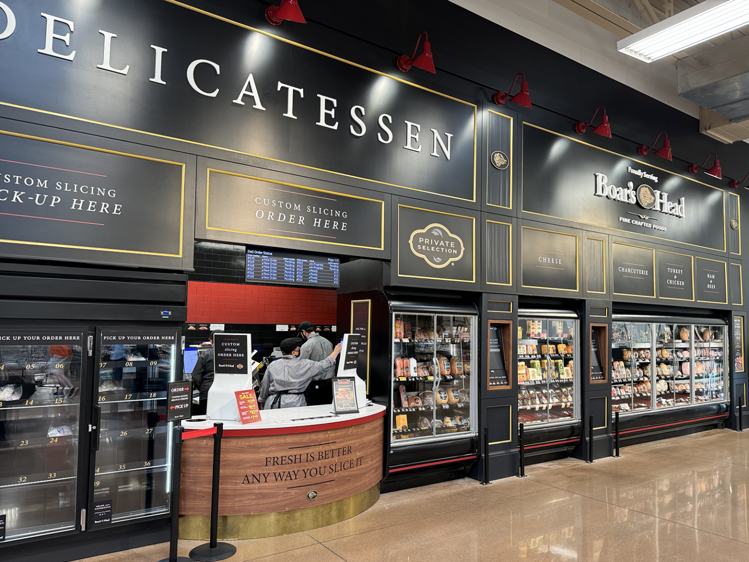
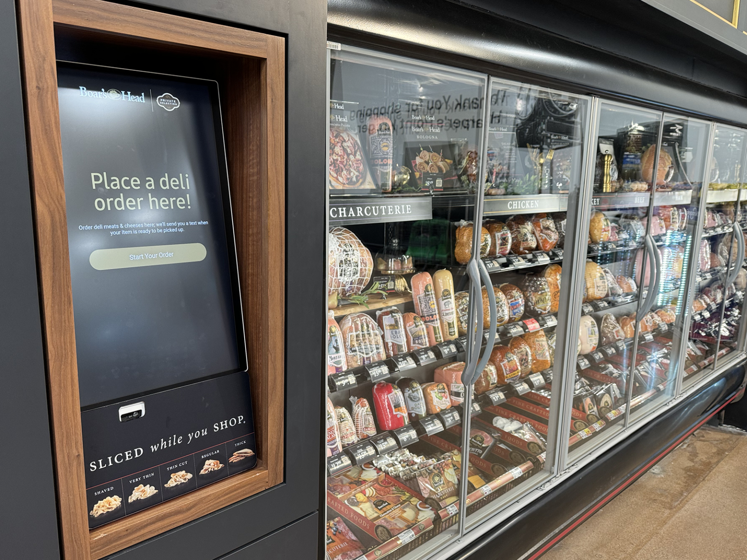
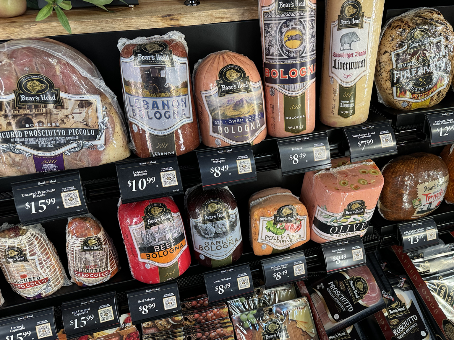
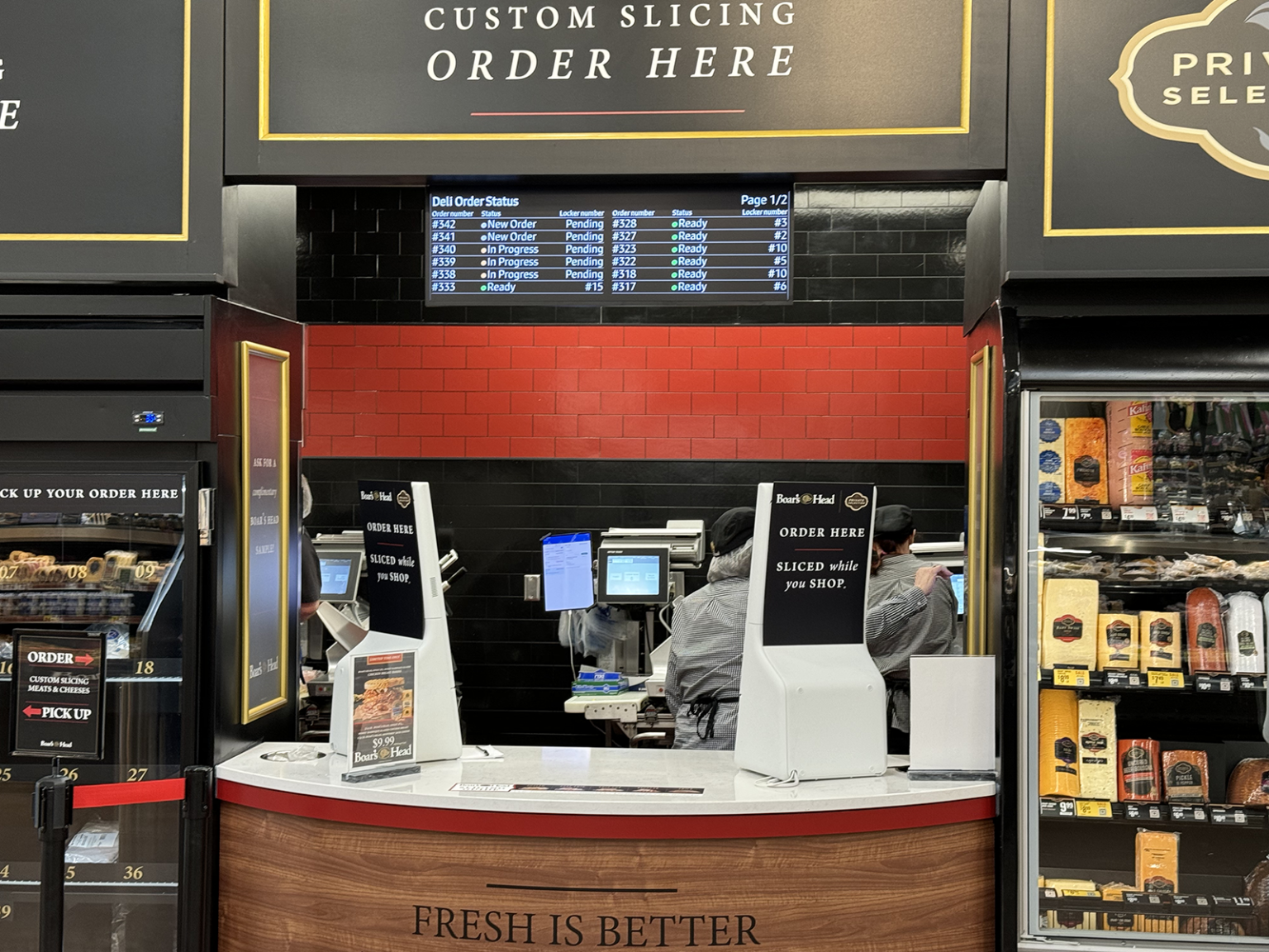
The deli counter I expected was gone. The expansive installation pictured below had taken its place. I was happy to see something unexpected and to find new ways to score the sliced meats I had on my shopping list.

Boar’s Head is the brand behind the concept. A corporate trainer of theirs was on site during my initial visit. We talked for a bit, and I found out that my hometown is a test market. Of course, I just had to ask whether the company is gathering data on shopper preferences and their interactions with the different ordering technologies. “You bet we are,” he answered.

That’s when I decided I’d take in the whole thing from a variety of professional perspectives. And as a consumer, I felt that serving as a data point for Boar’s Head would be a small price to pay for olive loaf.

The Boar’s Head Delicatessen installation at Kroger

The installation’s look and feel make it stand out in the grocery store. A sensible layout and large-format signage aid in product selection and wayfinding. Shoppers have three options for placing orders, two of which are digital-first.

Why is this appealing?

The deli concept is a win for the consumer and a win for the brands that enjoy shelf space: Boar’s Head, Kroger (Private Selection), and possibly others. Shoppers now have multiple ways to order — touchscreens, QR codes, and face-to-face — and can do so in a visually appealing environment. Meanwhile, the choices shoppers make and the quality of their interactions with the different ordering processes serve as quantitative, longitudinal data for marketers and experience designers. Ultimately, the data will enable Boar’s Head and others to make high-quality decisions about products, ordering, in-store-presence, and more.

But there’s more to it than that. The concept shows that even something as constant as the grocery-store deli can change to accommodate modern preferences while simultaneously continuing its service as a faithful fixture. It’s also a great example of showing vs. telling. Boar’s Head doesn’t have to say that it’s interested in making the deli experience faster, easier, or more modern. The brand shows it throughout the installation.

Let’s also appreciate the fact that there’s no good/better/best model here. All three ordering experiences are essentially consistent with one another, which means it all comes down to subjective consumer preference.

Someone who favors technology can either use a touchscreen or their phone to build, customize, and complete an order. A handful of taps on a screen puts sandwich-ready liverwurst within reach. But no one is penalized with a lesser experience for choosing the face-to-face option — although breath freshness is a variable for everyone in the transaction to consider.

What kind of innovation is this?

The new deli concept is an example of component innovation: changes to certain aspects of a product or system. The installation and the ordering technologies are the most obvious changes to the long-standing system.

Visual merchandising deserves attention, too. No longer are the cheese and meat chubs (yes, that’s what they’re called — and yes, I’m all too happy to call them by their technical name) resting lengthwise. They’re now upright, showing off color, packaging, branding, and other elements that attract the eye and aid in product differentiation. We also see product groupings by category, such as charcuterie, where shoppers will also find complementary products — olives, for example. Smart cross-selling, Boar’s Head.

The prototype is unquestionably innovative in that it introduces a new set of ordering experiences in the context of a grocery store delicatessen. It doesn’t matter that touchscreens and QR codes aren’t new; it’s the integration of technology in what was previously a tech-free place that counts.

Touchscreens and QR codes are ubiquitous. Many who don’t want to fool with such fancy doohickeys still are likely to at least know what they are. And their ubiquity is a result of sustained, widespread engagement over many years.

The technologies Boar’s Head chose are compatible with many people’s current shopping preferences and behaviors. That compatibility improves the likelihood that people will adopt the innovation the next time they need a pound of thinly sliced mortadella.

Moving on. The deli installation doesn’t fit the definition of disruptive innovation. Here’s why.

First, the concept doesn’t introduce something completely new with the specific intent of opening a new market. Instead, it offers new features designed to increase consumer satisfaction in an established market and improve important performance trajectories for the business: sales volume and ticket size.

And second, it doesn’t sacrifice functionality that consumers value in order to enter a new market. That’s actually a good thing in this case. No one wants a trip to the deli to be difficult. Here, Boar’s Head wisely elected to maintain status quo while pursuing innovation in parallel.

Regardless, iterative design is at work here. Many of the issues I encountered during my visits stem from a minimum-viable-product approach to rolling out features and functions.

One last point. The prototype installation is rich in observability: the opportunity to see that the innovation works and how well it works. Boar’s Head will know soon enough, based solely on all of the interesting data they’re collecting, whether their innovation was successful. On-site traffic, sales volumes in X amount of time, use of the touchscreens, use of the QR codes, counter sales, ticket size, consumer sentiment, and lots more will tell the story the company needs to hear.

Now, let’s shift our attention to the ordering experiences.

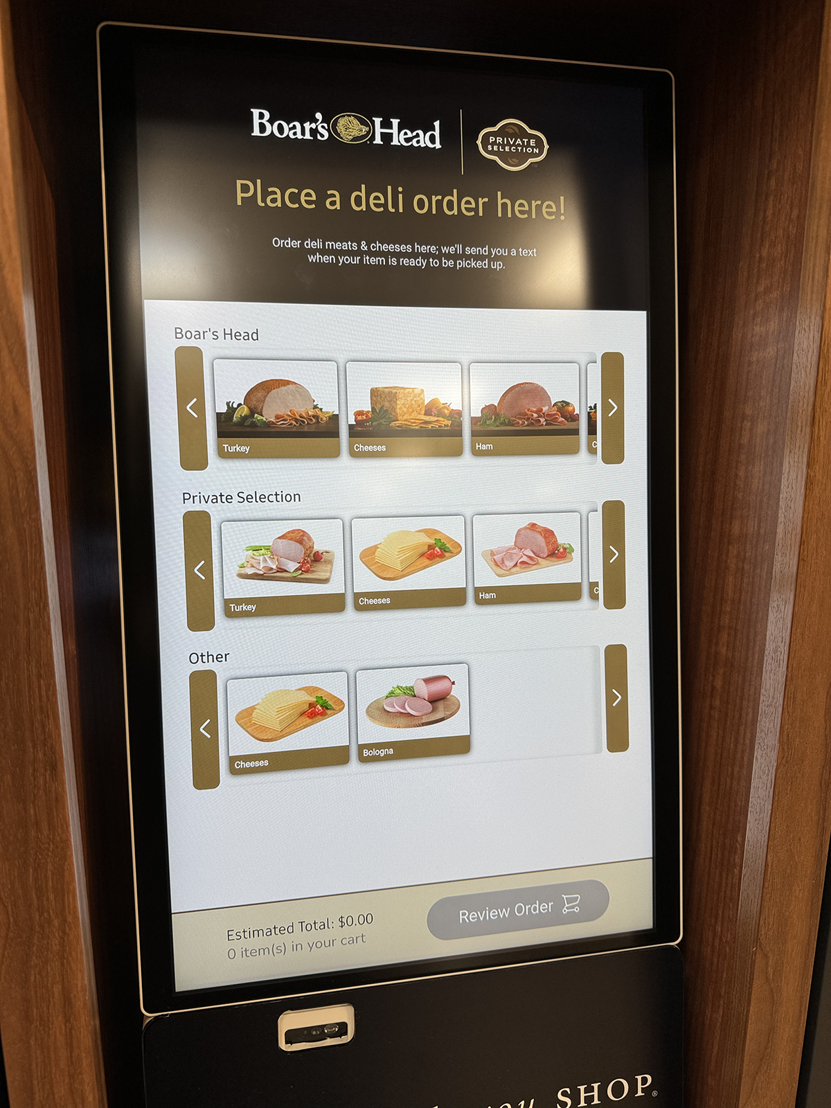
Touchscreen

The touchscreen guides the shopper through the entire ordering process. Two stations are available. They feature large displays and present content in modular layouts with ample white space. Icons are large and accessible. Touch-response time is good.

Touchscreen experience
1. Select brand and category

The interface does a nice job of guiding the shopper. Images and icons make the experience intuitive.

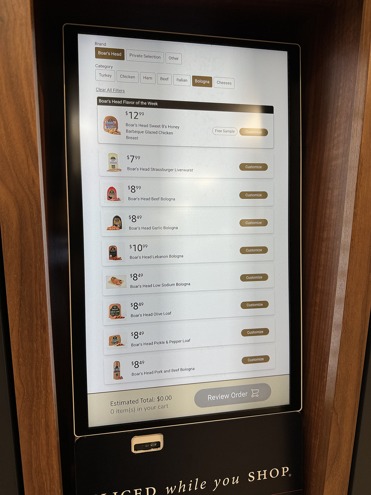
2. Choose the product

The menu displays product images, prices, and names clearly. One tap brings up the product-customization page.

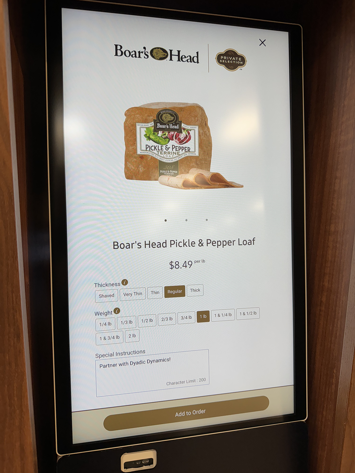
3. Customize the order

Customization is easy. Here, the shopper used the Special Instructions area to offer Boar’s Head excellent advice.

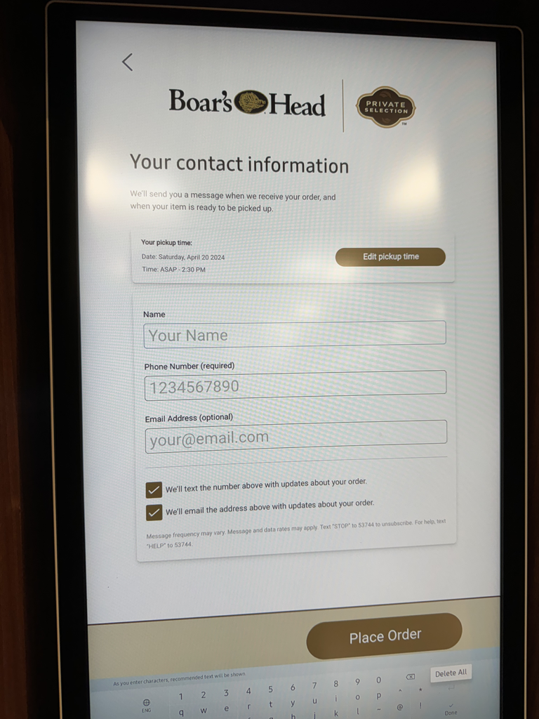
4. Complete the order

The shopper enters pickup time and how they’d like the deli to contact them when their order is ready. I opted for both and received neither.

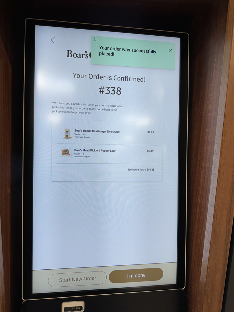
5. Order confirmation

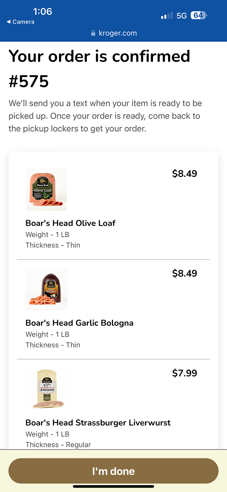
The system displays an order number, a summary of the order, and a total price. The shopper can then enter a new order or end the process.

Touchscreen: pros, cons, unknowns

Pros
  • Self-service
  • Alternative to in-person ordering
  • Does not rely on shopper-owned tech
Cons
  • Potential for long lines
Unknowns
  • What are shoppers expected to do if they have questions or encounter a technical issue?

QR code

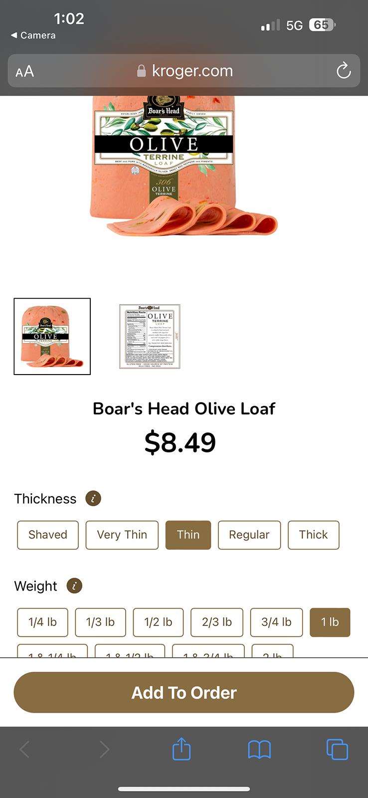
Each item’s shelf tag features a unique QR code that enables shoppers to create and place orders on their phones. Scanning through the glass refrigerator doors doesn’t work well. Open a door, and then scan. The web-based experience that follows a code scan is mobile-first and does a nice job of mirroring the touchscreen ordering process.

QR code experience
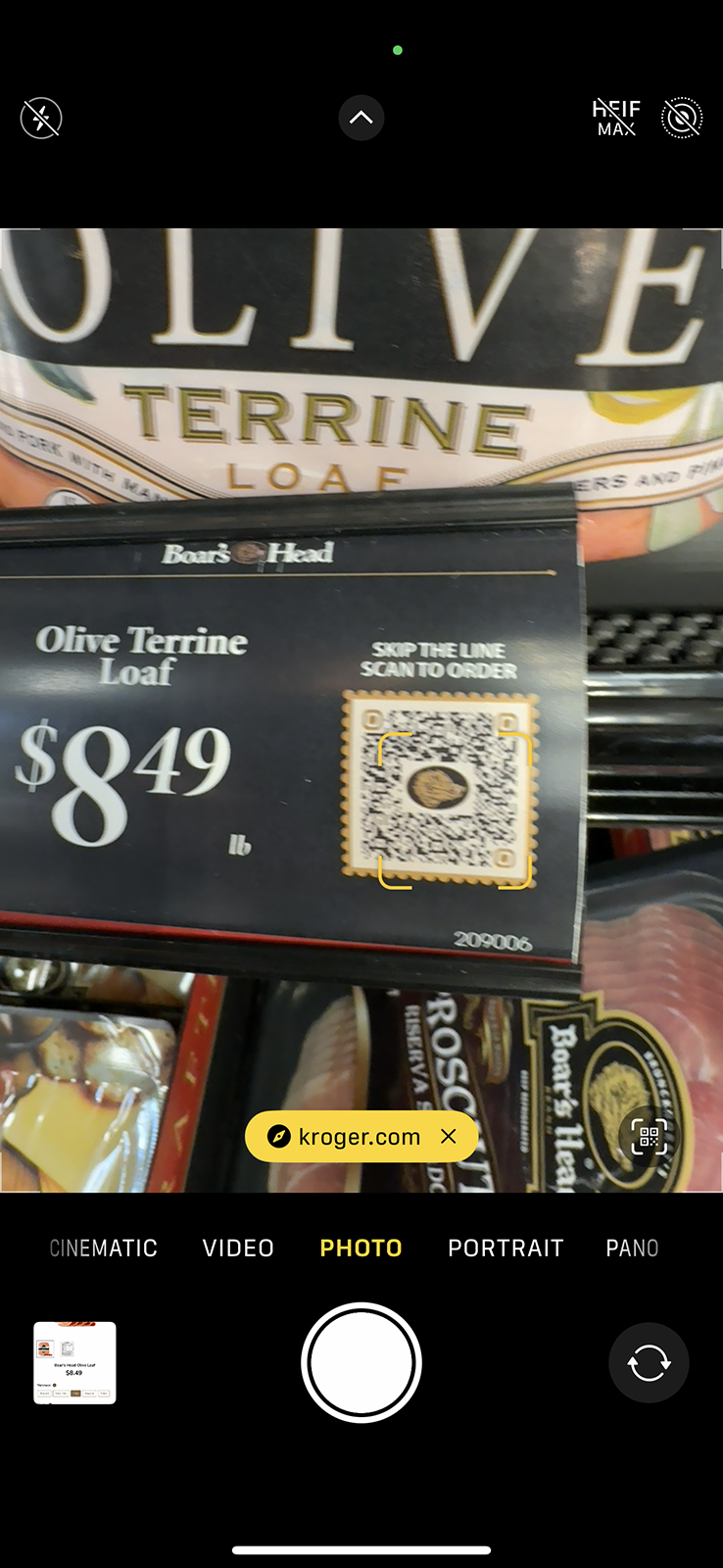
1. Scan the QR code

The process here is no different from scanning any QR code with a phone’s camera. Unfortunately, scanning through the glass doors was nearly impossible.

2. Customize the order

The web experience uses white space effectively and offers generously sized buttons — both of which make the customization process pleasant.

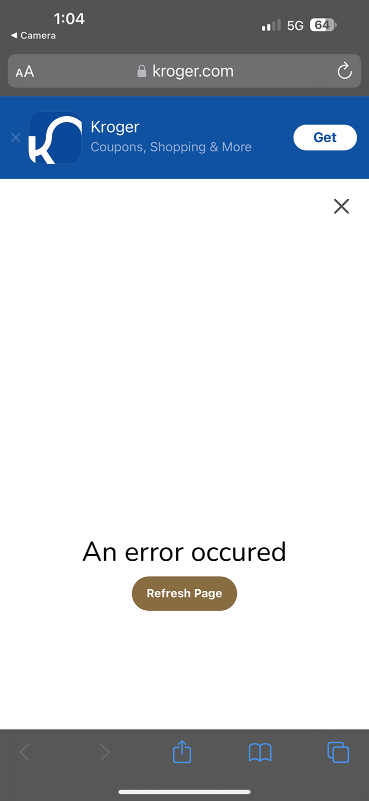
3. Frustrate the shopper

This is what happened when I tried to add some olive loaf to my order. The Refresh Page button did nothing. I had to restart my order. The word occurred is misspelled.

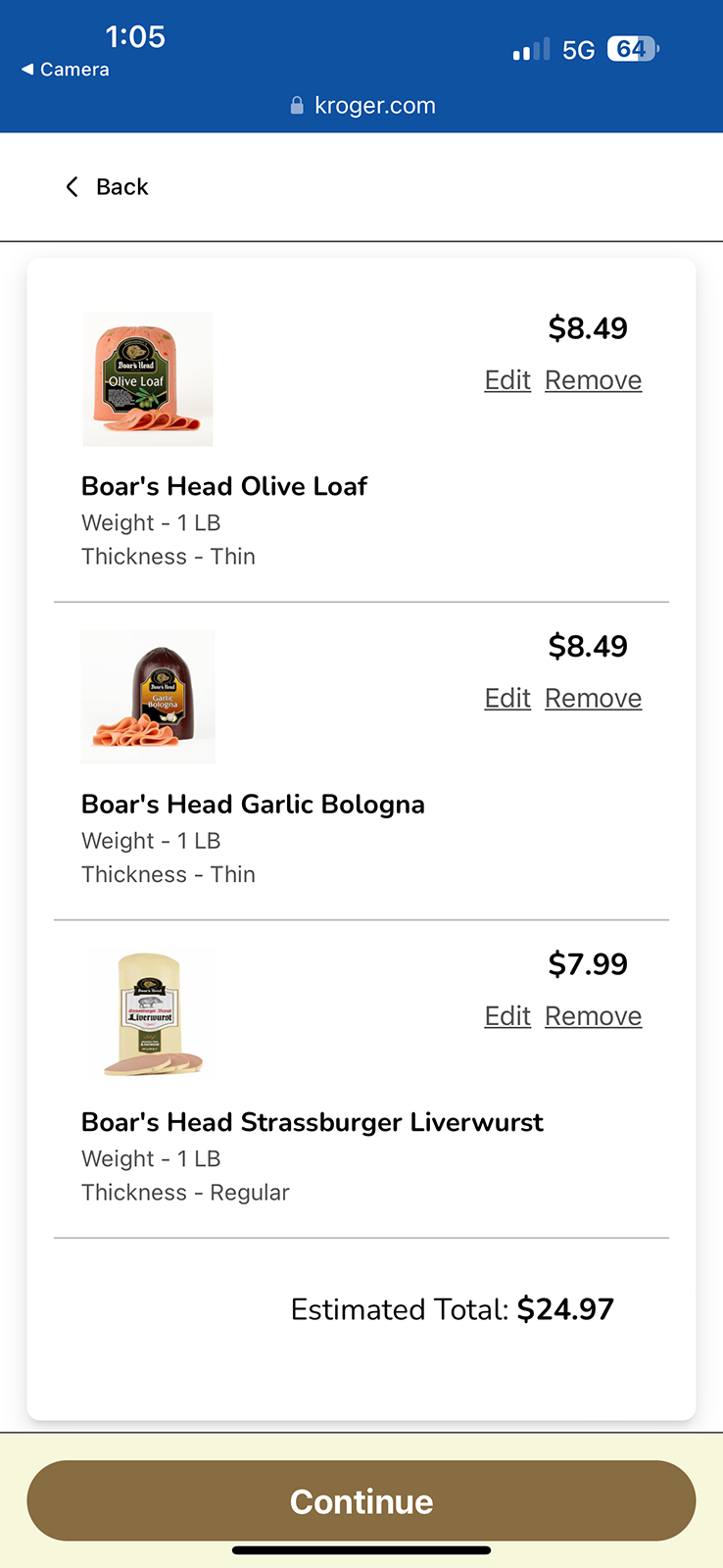
4. Review the order

The screen displays product choice, personalization, and price, legibly. The modular design looks great. The use of white space is effective.

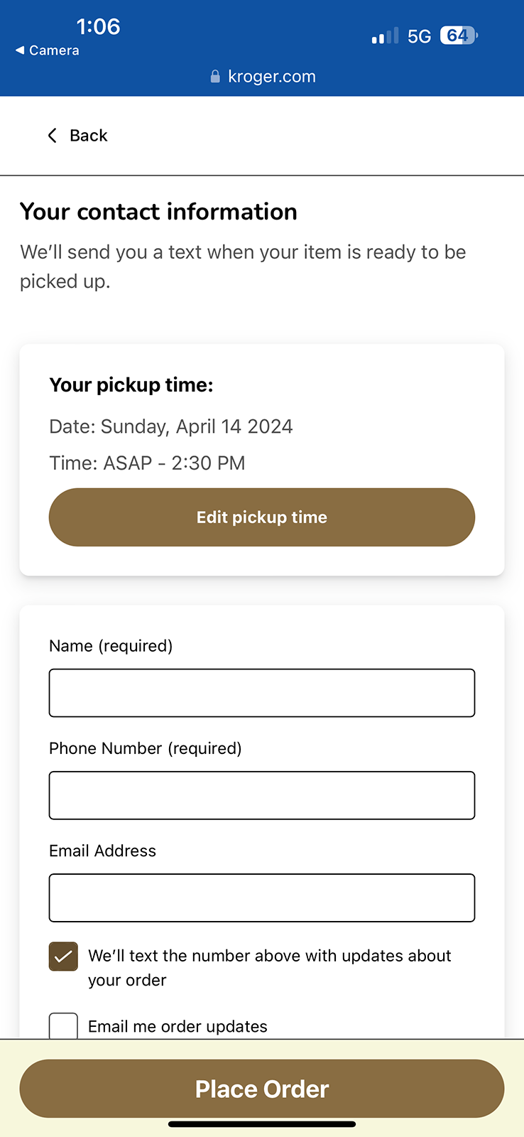
5. Complete the order

The experience mirrors the touchscreen. I opted for a text message to alert me when my order was ready. I did not receive one.

6. Order confirmation

The system displays an order number, a summary of the order, etc.

QR codes: pros, cons, unknowns

Pros
  • Self-service
  • Alternative to in-person ordering
Cons
  • Relies on shopper-owned tech
  • Inconsistent performance when trying to scan through glass doors
Unknowns
  • What are shoppers expected to do if they have questions or encounter a technical issue?

In person

Those who prefer a more traditional deli experience can choose to place their orders face-to-face. The process is essentially consistent with the technology-enabled options. Of course, the big difference is that it’s a verbal, person-to-person transaction.

In person: pros, cons, unknowns

Pros
  • Personal service
  • Alleviates pressure of using unfamiliar technologies
Cons
  • Potential for long lines
  • Potential for human error on both sides of the transaction
  • Interactions with frustrated customers who tried using the fancy doohickeys unsuccessfully — or who just want everyone to know that back in their day, people ordered their bologna at the deli counter
Unknowns
  • None at this time

Critical assessments

Most of my experiences with the Boar’s Head deli concept were very good. Not everything was perfect, though. Here are some things that stood out.

Code scanning

Not being able to scan QR codes through the glass refrigerator doors consistently (or at all, really) was a little frustrating. Someone who wants or needs to operate their phone with two hands will have to open the door and prop it open against their body before they can scan a QR code.

Some consumers will feel that keeping the door open to scan items wastes energy. Even though this is a minor inconvenience for the average shopper, it’s still a barrier to participation in general and a deterrent when it comes to scanning multiple items.

System issues

Take a look at the QR code experience section above. You’ll see that a system error prevented me from putting my order together. I used the Refresh Page button, but that didn’t clear the error or return me to my order. I had to start my order over completely, which was inconvenient. It would have been significantly more painful had I already added several items to my order, and I would have abandoned the QR code option to avoid a repeat.

On-site support

Seeing nothing more than a Refresh Page button and a generic error message in which the word occurred was misspelled wasn’t good — but even worse was the fact that there were no instructions for getting help or returning to my order.

At the very least, I would expect to see an apology. Even better would be an apology accompanied by simple instructions for getting help and completing my order — even something as basic as: “We’re sorry our ordering system isn’t working as it should right now. A deli team member at the counter is ready to help you place your order.”

The best approach would be the apology, the instructions for getting help, and a message saying I’ll get a discount for the inconvenience. After all, the only thing better than pickle and pepper loaf is 10% off pickle and pepper loaf.

Order timing

You can see in the QR code experience section above that I completed my order at 1:06 p.m. You can also see that I selected ASAP to 2:30 p.m. for my pickup time. That was the earliest pickup slot available. ASAP is ambiguous, and 2:30 p.m. is nearly 90 minutes from my order time, which is quite a long stretch.

The only thing editing my pickup time would do is allow me to make it later in the day. Not a great option. Shoppers who are at that Kroger store only for deli items, or who don’t have much other shopping to do, won’t be pleased to see the possibility of a 90-minute wait — and they won’t know what ASAP promises.

Here’s what they can do: wait at the deli, walk around the grocery store, or wait in their car. And they won’t have any idea how long they’ll be waiting or walking because ASAP isn’t a service-level guarantee and nothing from the deli merits waiting for 90 minutes — not even the garlic bologna. In fairness, all of my wait times were between 15-20 minutes.

A consumer who only needs deli items can use the order ahead option via the Kroger website or app, wait 15-30 minutes, and then pick up the meats that give their life meaning. But do people know about it? I didn’t see it promoted at the deli.

Order notifications

I used all three ordering methods available and never received a single notification. I’ve never opted out of receiving texts or emails from Boar’s Head or Kroger. These are transactional notices, not promotional messages, so there really should be no stopping them. There were no messages from Boar’s Head or Kroger in my junk folders, either.

Not knowing when my orders were ready was inconvenient. Pairing that with not knowing when my orders would be ready led to a poor customer experience. Disconnections like these lead to the kind of fatigue that will prevent some shoppers from visiting that deli again.

A new dimension in deli

Boar’s Head is trying a lot of great things with this concept. By the way, it’s called Pinnacle Deli — something I learned much later on, after several visits. The installation itself is a bold standout in an otherwise predictable grocery-store environment. Bringing in self-service technologies that many shoppers are already using is a shrewd play because they funnel in tons of actionable data at a nominal cost and with low risk.

Boar’s Head is providing shoppers choices they never had before at the deli — a great example of the relative advantage of the innovation with which the company is experimenting right now. And it’s possible that they’ve addressed some of the issues I’ve raised here. I’ll find out the next time I need olive loaf.

If you have questions or would like more information, please contact me.

Important disclosures

I’m not affiliated with Boar’s Head or Kroger. They’re not Dyadic Dynamics clients. They didn’t ask me to write or publish any of this, and no one is paying me for this article. I must be out of my mind.

Original date of publication: June 20, 2024


More gems for you

How Polar Handles Troubles with its Bubbles

The Magic of Mushroom Marketing

How to Prevent Inbox Burnout

The Case for Continuous Improvement

The Art of the Apology

Influencing People’s Perception of Bad News

Strategy Visualization and Storytelling

  • Page 1
  • Page 2
  • Go to Next Page »

Dyadic Dynamics

Copyright © 2025 · Dyadic Dynamics, LLC

Privacy Policy  /  Terms and Conditions